Categories
donald trump Interior Design

Trump used his tacky interior design ‘gold guy’ to remake the White House


Last week we talked about Donald Trump, noted interior design aficionado, making noticeable changes to White House decor. The first edit happened in the Grand Foyer, where it’s traditional for the two most recent presidential portraits to be on display. So naturally Trump replaced Obama’s portrait with “artwork” depicting his own failed assassination attempt. In the Oval Office, a Swedish Ivy plant given to JFK by the Irish ambassador sat prominently on the fireplace mantel for 60 years. Trump deported that plant for parts unknown and set up a suite of gold statuettes instead. Deplorable. Turns out, Trump had professional help in making the White House gold again: the Wall Street Journal reports that he flew in his “gold guy” from Florida to (heavy-handedly) sprinkle the Midas Mar-a-Lago touch, for an overall style that I’m calling “Ego Rococo.”

A piece in The Wall Street Journal published on April 16 revealed that the politician, 78, enlisted cabinetmaker John Icart, who has worked on projects at Mar-a-Lago, to add gold finishes throughout the White House.

The newspaper reported that Trump has added multiple gold-colored touches throughout the government building, including golden borders to his and Vice President J.D. Vance’s portraits, gilded carvings for the fireplace mantel, a gold Trump crest in a doorway and gold coasters with his last name on it, among others.

Trump also reportedly brought gold cherubs from his Mar-a-Lago resort.

Icart is reportedly the person responsible for executing some of the president’s major design choices and was referred to as Trump’s “gold guy” by an adviser, per WSJ.

The Florida resident reportedly traveled to Washington, D.C., with Trump on Air Force One to assist with the decorations. While Icart declined to comment on the article, White House press secretary Karoline Leavitt told the newspaper in an email, “It’s the Golden Office for the Golden Age.”

Trump had another flashy interior design idea in mind for the White House that never came to fruition, according to WSJ.

An administration official told the outlet that the president had the Oval Office examined to see if he could hang a chandelier in the room, but was told it was too heavy for the specific location.

In a March interview with Fox News’s Laura Ingraham, Trump opened up about his gold design choices while giving her a tour of the White House.

When Ingraham pointed out the cherubs from his Mar-a-Lago estate, he said, “They’re gold, all gold. It’s angels. They say angels bring good luck and we need a lot of luck in this country with what they’ve done over the last four years.”

The camera then panned to show the flashy gold fixtures throughout the building.

“Throughout the years, people have tried to come up with a gold paint that would look like gold, but they have never been able to do it,” Trump explained of the symbolic color. “They’ve never been able to match gold with gold paint, that’s why it’s gold.”

[From People]

I can’t help but feel like this is what they’re letting Donny boy play at while the people really in charge work on dismantling the government. Anyway, a few things: I’m positively shocked he deigned to extend the gold border to JD Vance’s portrait. I honestly would’ve expected no frame/border at all, or at the very least, silver. Maybe gold is just the only color he can think of these days. What am I saying, there’s always orange! What else… A chandelier in the Oval Office was ruled out for being too heavy for the building. Where exactly in the Oval was this planned for, right over the desk? I think you know where my mind is headed with this.

Out of a bouquet of things to pick apart, though, it’s this quote that’s doing me in: “Throughout the years, people have tried to come up with a gold paint that would look like gold, but they have never been able to do it. … They’ve never been able to match gold with gold paint, that’s why it’s gold.” What in the ever-loving f–king hell is this nonsensical, failed cognition test of an arrangement of words? It’s like a really, really, bigly bad Dr. Seuss passage. “They don’t have paint that looks like gold, that is the lie that I’ve been sold. They do not have paint that can match, not enough to make a splatch.” Also, is there some international intelligence conspiracy afoot to keep Trump from learning that there IS in fact gold paint? I’m not against such a thing, I just want to know.


Photos credit: Ufficio Stamapa/AGF Foto/Avalon, Geopix/Avalon, Chris Kleponis/POOL via CNP/INSTARimages.com, POOL via CNP/INSTARimages.com, Ufficio Stamapa/AGF Foto/Avalon

Categories
Interior Design Ivana Trump Real Estate

No one wants to buy Ivana Trump’s tacky NYC townhouse

Embed from Getty Images

Ivana Trump, the incoming dictator’s first ex-wife, passed away in the summer of 2022 after falling down the stairs of her six-story NYC townhouse. The cause of death was classified as blunt force trauma resulting from an accident and the whole incident was perfectly legitimate and not sus in any way (despite there being an elevator in the home). Anyway, the home went on the market shortly thereafter in November 2022 for $26.5 million, roughly $3,000/square feet for the residence that’s just under 9,000 square feet total, including some outdoor space. Shockingly, there were no buyers. So a year later they dropped the price for a month, before taking it off the market entirely for a wee spell. It went back up in June of this year, this time at $19.5 mill. And still no takers! Mayhaps it has to do with the objectively tacky interior design that Ivana personally oversaw (in the 90s) that comes with the property?

The late Ivana Trump’s New York City townhouse is still on the market more than two years after her death.

The property was first listed in November 2022, four months after the businesswoman died at age 73 after falling down a flight of stairs in the home on July 14.

It was initially asking $26.5 million. After almost a year on the market, the price was slashed to $22.5 million in September 2023. A month later, the listing was taken off the market and then relisted for a lower price in June 2024 for $19.5 million.

Ivana, who was married to Donald Trump from 1977 to 1990s, moved into the townhome shortly after their split. Very little has changed since she renovated the property in the ‘90s.

Following Ivana’s death, it was revealed by the New York City Medical Examiner’s Office that she had suffered blunt force injuries to her torso as a result of the fall. Officials pronounced her dead on the scene and ruled the incident as an accident.

The home, located in Manhattan’s Lenox Hill neighborhood, is jointly listed by J. Roger Erickson of Douglas Elliman and Adam D. Modlin of Modlin Group.

The townhouse spans six stories and features five bedrooms and five full bathrooms. Lavish finishings include a crystal chandelier, silk wallpaper and a gold-embossed fireplace in the second-floor living room.

A gated elevator and a central, curved staircase connect each floor. The Versailles-inspired dining room’s vast windows overlook the private interior courtyard.

An expansive primary suite occupies the entire third floor. From the bedroom, three French doors lead to the private outdoor terrace. The ensuite bathroom boasts pink onyx marble and includes a double sink and a large soaking tub.

Across the bedroom is an office adorned with leopard print furniture and an onyx fireplace with gold detailing. Adjacent to the office is a walk-in closet.

On the remaining floors, guest rooms overlook the stately homes on 64th Street. The impressive space also boasts a media room and a sauna.

[From People]

Ok, so whose bright idea was it to sell the place fully furnished? I’m no realtor, but I have been watching HGTV for well over 10 years. Plus, I have EYES. No one wants that townhouse as-is. No one is going to walk in there and think, “Oh thank heavens they kept it intact. I’ll take it all!” What people are seeing when they look at the listing is all the millions on top of the initial price tag that will have to be spent on extensive renovations. And look, I freely admit that like the inimitable Iris Apfel before me, I’m a more is more girl. I like bright colors, mixing patterns, and I cannot honestly say that I wouldn’t decorate a room entirely in leopard. But the thing about going over-the-top is, the pieces you’re working with still have to be tasteful. So… yeah. But bless J. Roger Erickson’s heart for trying, like in this video tour where he claims that pink onyx is back in for bathrooms. Honestly, though? I love this for Don Jr., Ivanka, and Eric, to whom the proceeds will go. You know, in the increasingly unlikely event someone actually ends up making an offer.

Embed from Getty Images

Categories
Interior Design Lists

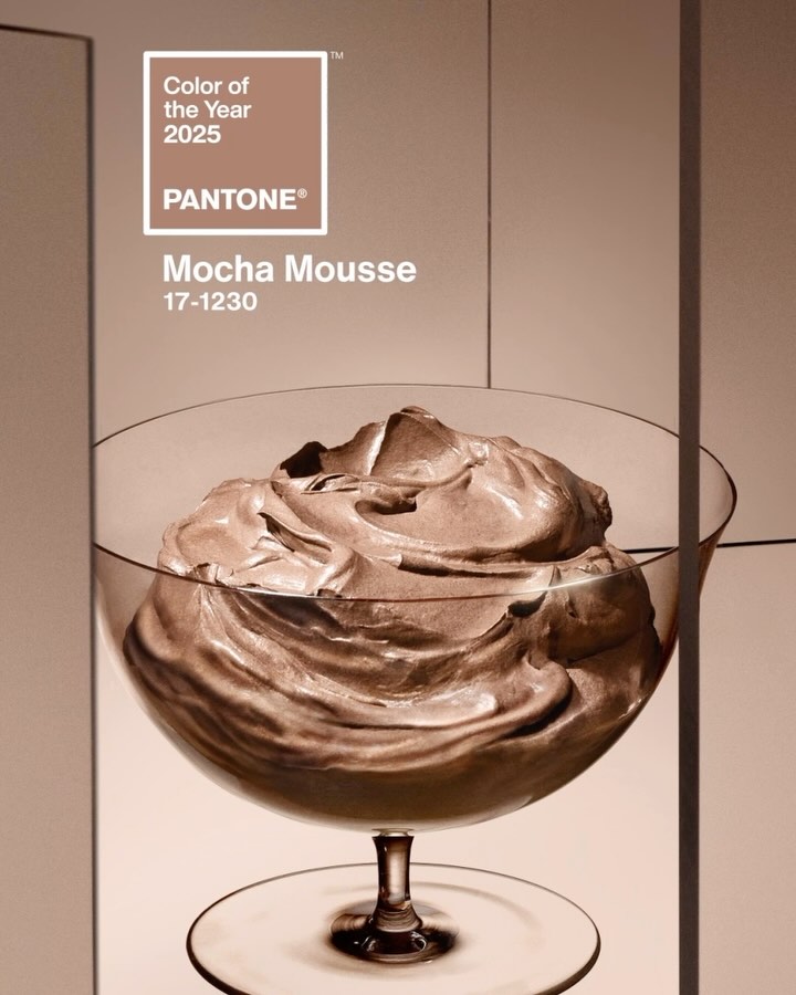
Pantone names its 2025 color of the year: Mocha Mousse


My excitement for what 2025 has in store melted away like sun tan in the rain when America elected to send a convicted felon and adjudicated rapist back to the White House. Call me partisan. But I still had one last bit of enthusiasm reserved, and of course it was for the Pantone 2025 Color of the Year. I’ve been waiting a year for this reveal, thanks to how utterly disappointed I was with the selection for 2024: Peach Fuzz. I was as underwhelmed and undercooked about Peach Fuzz as the raw chicken breast hue it resembled. Well, friends, the wait is finally over! And what dazzling shade has Pantone come up with to redeem themselves from last year’s fail? Mocha Mousse! Is it the electric shock of color I was looking for? Nope! But is it better than sad peach? You betcha! Please enjoy some effusive, decadent language from Pantone on how Mocha Mousse is the sanctuary of harmony the world has been craving:

Color us shocked. Pantone’s shade of the year has been announced and it’s… brown?

That’s right: Brat Summer’s neon green and “Wicked’s” watermelon-chic aesthetic are so 2024, with the color company announcing Thursday morning that the shade for 2025 is a more demure Mocha Mousse.

PANTONE 17-1230 (Mocha Mousse’s government name), is a serene, lightly pigmented color. It’s “a mellow brown infused with a sensorial and comforting warmth,” Pantone Color Institute vice president Laurie Pressman tells USA TODAY.

Meant to engage multiple senses, the color should evoke a desire to dip your spoon into it, Pressman says. Inspired in part by “little treat culture” — a growing trend in which people punctuate their day with small pleasures like a store-bought coffee — Pressman encourages fans to “find your mocha moment.”

“Little treat culture really goes back to boosting our sense of personal comfort and wellness,” she says. That the color reflects a cup of coffee with one-too-many dashes of cream or a smooth milk chocolate is intentional. The name too is meant to tickle your tastebuds.

Aside from the more obvious chocolate connection, Pressman and Leatrice Eiseman, the Pantone Color Institute’s executive director, tell USA TODAY that the shade creates a sense of harmony and warmth.

…“The overriding theme as we went into looking for this year’s color was this whole idea of harmony,” Pressman says. As the world becomes more complex, consumers are searching for inner peace and balance, she says. A “versatile” light brown that can reflect both luxury and an alignment with the natural world is the perfect shade to communicate that desire.

“We have enough going on outside of us we’re looking for things that are softer and things that are lighter,” Pressman says. As for those “dopamine brights” (read: Barbie pink and Brat green), there’s a place for those as well, but mocha mousse reflects a mood much larger than any fleeting zeitgeisty trend, she says.

[From USA Today]

Hey, don’t knock my “dopamine brights,” Pantone! That’s the world I live in, and I have the apartment and wardrobe to prove it! That being said, and as long as “harmony” seems to be the key word, I do appreciate the value in a neutral — or, excuse me, “demure” — tone like mocha mousse, because it’s those browns, taupes, and grays that really allow the bolder colors to zing. If you put raspberry next to mocha mousse, the raspberry will vibrate in a way it just doesn’t on its own. Clearly all the food imagery Pantone conjured in their press announcement has successfully infiltrated my brain, lol. And if we’re being honest, that is probably how mocha mousse will actually manifest for me in 2025: an increase in my combined coffee chocolate indulgences.

Though the color of the year is brown, the color of the millenia is green, so naturally Pantone has multiple commercial partnership deals in the works to make money out of mocha mousse. Motorola, Joybird, Society6, and Post-Its are just a few of the companies releasing products in the sophisticated brown hue. But in a new twist, Pantone is also launching installations in cities across the world, the first one being the London Eye. They bathed the attraction in mocha mousse lighting, prompting the hilarious online comment, “Appropriate that it rained because it looks like mud.” Like they say: when in London, be salty!

Lol same https://t.co/FioyS7jRdc pic.twitter.com/JVBFGgLOBE

— MoonPie (@MoonPie) December 6, 2024

Categories
Interior Design Jennifer Garner

Jennifer Garner built a Harry Potter room for her son under the stairs


I love watching Architectural Digest’s YouTube channel. Some of those crazy expensive houses that they highlight are to die for. I’m absolutely one of those people who loves looking at real estate listings for fun while d-cking around on the Internet during downtime. I really like when AD does the celebrity home tours. I can trace this back all the way to Mariah Carey’s 2002 MTV Cribs tour! That one was so iconic. Remember when she showed off her insane bathroom only to then confess to having only used the shower one time because she couldn’t figure out all of the knobs to turn it off? Absolute diva.

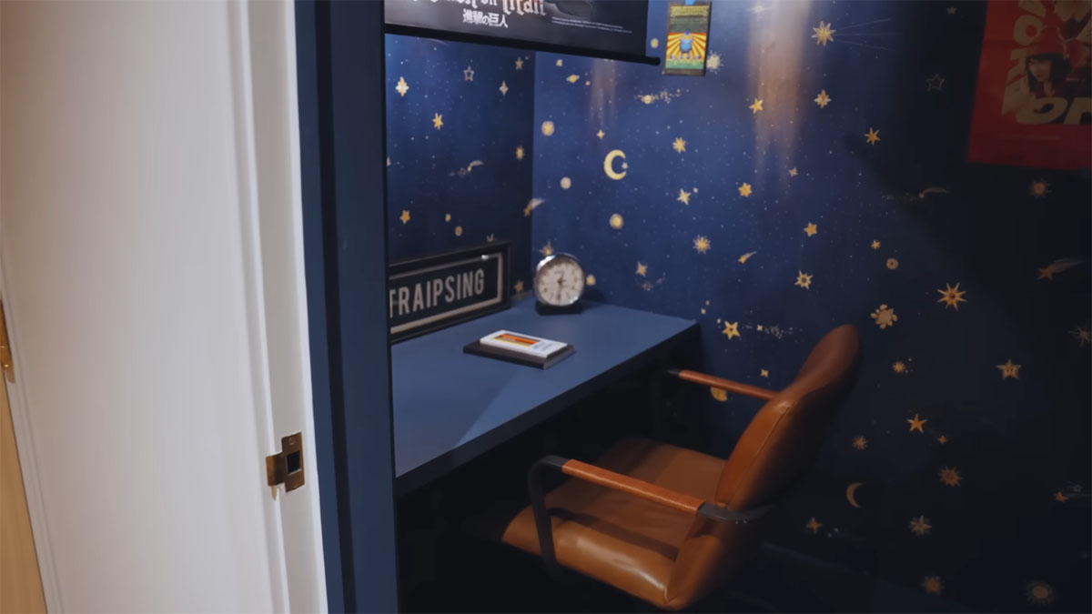
Anyway, Jennifer Garner did an AD tour last week for her custom-designed Los Angeles mansion. It’s absolutely gorgeous and although it’s super fancy, it’s also pretty down-to-earth. The video is around 11 minutes long and shows off a stunning living room with giant doors that open up to extend it out into a giant patio, a crazy “slumber party” room with a bunch of bunk beds for when her kids have friends over, and a Harry Potter-themed reading nook/office for her 12-year-old son, Samuel, which is, appropriately, in a space underneath the staircase.

Jennifer Garner opened up her gorgeous Los Angeles home for an Architectural Digest tour and it did not disappoint. From a Harry Potter-themed office for her son to an unofficial slumber party room, Garner’s home both centered on her children while simultaneously showcasing stunning design.

Garner, who built her home with designers Steve and Brooke Giannetti, walked fans through the modest mansion.

“I’m such a private person about my home and here I’ve just taken you through the entire house, and really it’s for a couple of reasons,” the actor said in the Architectural Digest video.

“I’ve never built anything all by myself before, and I’m so proud of it. I’m filled with gratitude every time I walk into my house, that I get to live here, that I’m so lucky to have my kids here. It’s unlike me, and yet I’m so happy to have shared it with you.”

Garner shares her three kids — Violet, 18, and… Fin, 15, and son Samuel, 12 — with ex-husband Ben Affleck. Throughout the tour, she mentions her kids’ activities in the home.

While showcasing the living room area — which featured an entire back wall of large sliding glass doors that open to create an indoor-outdoor space — Garner jokes that sometimes she has to look away when damp teens come inside from the pool.

“The only problem is, if my kids are having their class pool party here or something, it’s very hard to keep wet kids out of the house,” she jokes. “I have to really just stand guard and say, ‘Get away.’ I’ll look over, and there will be two wet teenagers playing the piano, and I’m just like, ‘OK, don’t look, don’t look.’”

Garner adds that she’s “so happy” with her cozy home, which she said makes you “feel like (you’re) inside a treehouse.”

“You know how you just imagine it, and then some day you have a perfect moment where it actually comes true? That is a, like, (chef’s kiss) kind of moment,” she says.

She showed off several gathering areas inside the home, including a gorgeous blue library/TV room, a study area with a giant fish tank and reading nook as well as a slumber party room with several bunk beds.

Garner also revealed her son’s Harry Potter-themed “office,” which, fittingly, is a small room under the staircase. Noting Garner and her kids are huge fans of the series — which opens on an 11-year-old Potter who lives in “a cupboard under the stairs” — they decided to make the room similarly magical. Painted a dark blue with darks and other fantastical elements, Garner says the room is meant to be a “little spot for him to come in and dream.”

“Mostly he hides from me and eats candy but I can’t blame him,” she jokes. “I’d do the same thing.”

[From Today]

Jen’s house is so nice! It really fits her personality. I love the Harry Potter office nook! That’s so clever. That outdoor deck and pool area is incredible, too. I also love that Jen confesses to keeping her children’s toys from when they were younger easily accessible because once in a while, as “big kids,” they’ll still pull those old toys out and play with them. That is so relatable because it’s so true! You know Jen Garner is that mom who takes Uno or some puzzle out on the weekends for them to do together while talking about life. At the end of the tour, she explains that she’s “so proud” of her house because she’s never built anything by herself before. I’m a big Jen fan going back to her Alias days and I’m really happy that she’s successful and not an a-hole about it.

Here’s Jen’s Architectural Digest home tour if you’re interested in watching it:

Photos are screenshots from YouTube/Architectural Digest

Categories
aging Interior Design Jeremiah Brent Queer Eye

Jeremiah Brent: ‘you blink, and holy sh-t, you’re 40’


Netflix confirmed at the beginning of March that Jeremiah Brent would be replacing Bobby Berk as interior designer for season 9 of Queer Eye. No sooner did this announcement come than did Rolling Stone print an article describing cast member Jonathan Van Ness — the beauty & hairstyling expert of the Fab Five — as a tantrum-prone diva, with the reporting coming from the accounts of still-shaken unnamed sources and production crew. But that wasn’t enough to send Jeremiah running for the hills, as filming has begun in Las Vegas. Just before production started, though, Jeremiah spoke with House Beautiful about a new book he has out, The Space That Keeps You, as well as his family, aging, and of course an insistence that there’s “no drama” with the new Fab Five:

Oprah’s Montecito mansion appears in his new book: It’s one of 11 homes featured in the book — but unlike the typical designer monograph, he didn’t work on all or even most of the projects therein. Instead, The Space That Keeps You is an exploration of old and new photos, doodles, handwriting, and detail shots. Getting it published was a fight, he says. “Very controversial! Everybody wanted me to do a coffee table book of my images, but that wasn’t what I wanted to put out there,” he says. Instead, his goal was “to shift the narrative around home, and how we create home, and what we bring into our spaces.”

Rachel Zoe changed his life, twice: “When Jeremiah walked into my office 15 years ago, there was just something about him,” Rachel Zoe tells House Beautiful. “He was young, and green but he had such great energy. Although he was selling himself on fashion, his passion was really interior design — I knew immediately that he had such a good eye and I wanted to give him a chance.” … It was Zoe who, witnessing his predilection for interiors, told him to make the business switch, and he launched his firm in 2011. The following year, he met Berkus at Zoe’s birthday party in New York City, and they married in 2014.

Brent & Berkus, “digestible gays”: Their business empire and fame rest on their taste and talent, yes, but it’s likely their good looks, undeniable charm, adorable family, and Oprah’s support that have made them your mom’s favorite designers. Brent has referred to their draw as “digestible gays.” “We feel a tremendous amount of responsibility to continue to move that needle,” Brent says. He hopes that window of digestibility is shifting, and it’s one of the reasons he’s thrilled to be joining Queer Eye.

And speaking of Queer Eye… Brent is set to start filming the Netflix juggernaut days after he chats with House Beautiful — and weeks after an investigative expose alleged tumult on the set, which seemed to explain the departure of the show’s previous design expert, Bobby Berk. Brent is, of course, ready to address the report. “I’ve got to tell you, there’s no drama with any of us. We’re all in a group chat. We’re having the time of our lives,” he insists. “Everybody’s heads and hearts are in the right spot. … There is an amazing art department and team behind the scenes that are working hard around the clock. I’m excited to get in there, roll up my sleeves, earn my keep, and hopefully show people some really beautiful designs.”

Turning 40: Later this year, Brent turns 40, and it’s the reminder of this fact that finally sends a cloud across his golden facade. “Why would you bring that up? That’s the meanest thing you said to me this whole interview!” he says, joking again. “Show me the birth certificate!” It’s a wild milestone, he says, because he remembers his mother’s fortieth so distinctly. “She had a birthday party in our backyard, and I was like, How embarrassing,” he says, imitating a withering tween tone. “Then you blink, and holy sh-t, you’re 40.” But he counts off the blessings of this age, from his children to the husband he’s “still obsessed with, despite his best efforts.”

[From House Beautiful]

Jeremiah should feel nothing but proud on his birthday! He gets paid to do what he loves, has a gorgeous family, and boasts one of the finest heads of hair in the western hemisphere. But really, no pressure though, I know we all process birthdays in our own ways. My suggestion would be to order a cake with a frosting inscription that says “Digestible Gays.”

As I’ve said here before, I adore The Nate & Jeremiah Home Project, and what undoubtedly makes it is the interplay between the husbands. You can tell that they cherish each other, and yet are also very much a married couple. So it will be interesting to see Jeremiah in a new setting. Even though he already knows the cast members, that’s still a world of difference from the ease and shorthand of working with your spouse. Not to mention the tight turnaround schedule for each episode. At least the location has changed from summertime New Orleans. Can you imagine what that humidity would’ve done to Jeremiah’s hair?!

Embed from Getty Images

Embed from Getty Images

Photos via Instagram and credit Getty

Categories
Interior Design Mental Health

Don’t stress about your clothes chair, it means you have a system


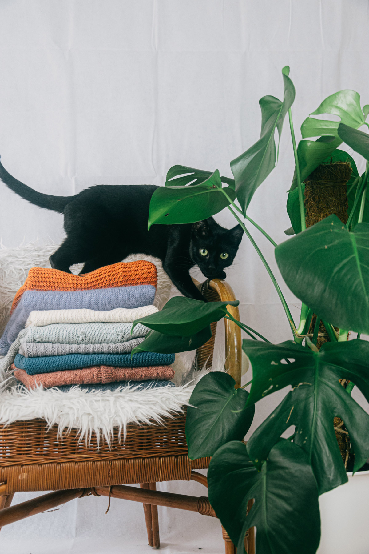
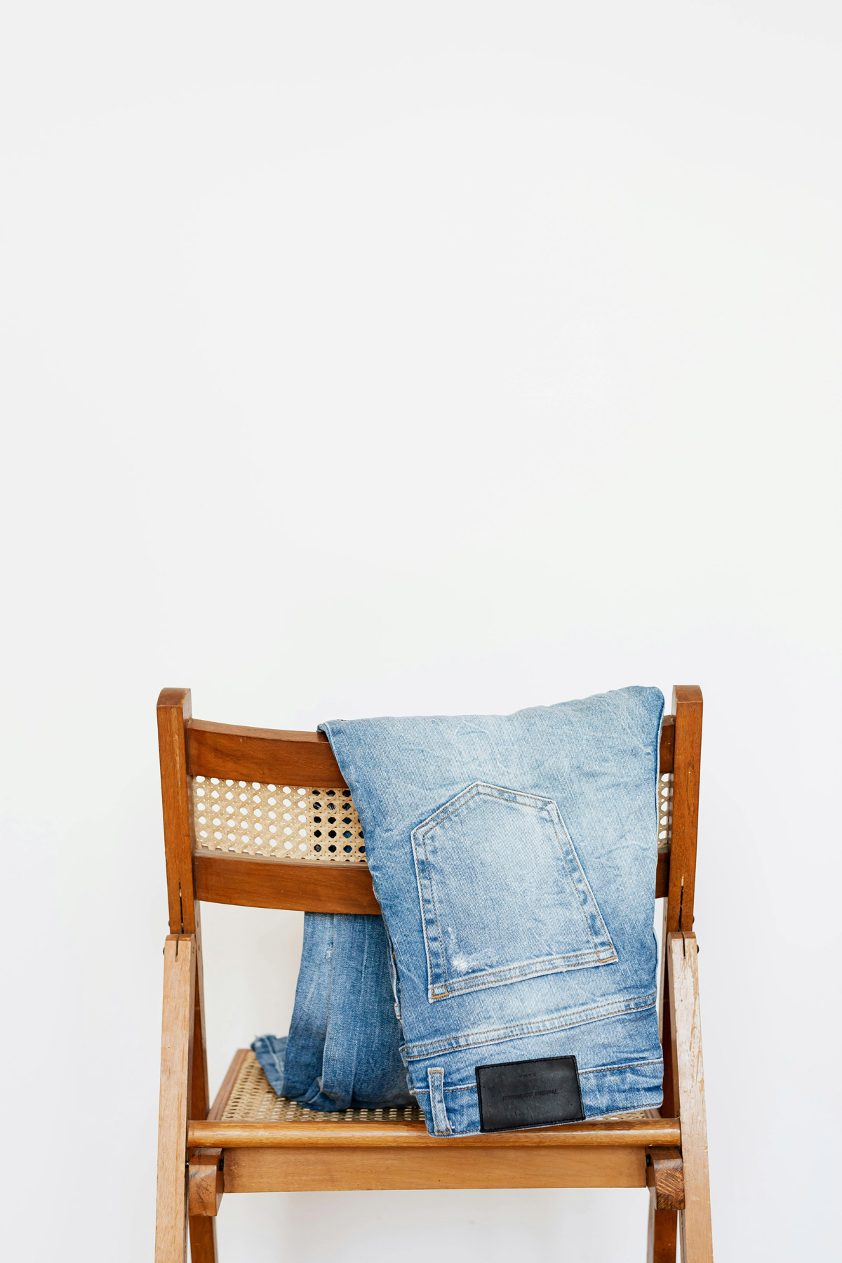
I have a chair in my bedroom that I use to lay out my clothing for the next day. Is it because I’m fancy? No. Well, I have been called “fancy,” but this pattern emerged because I don’t trust myself to do anything when the alarm goes off in the morning. Strictly rote tasks only in the AM: brush teeth, get dressed, walk/feed dog, COFFEE. But selecting which clothes to wear, that’s one decision too many. In the last couple years the chair has also become home to some of my pants, with pairs I’ve just worn going to the bottom of the pile. Some will say I’m just too lazy to put the pants away in a drawer or in the closet, I say I’m a creative bedroom landscape architect. And now I have The Washington Post to back me up! WaPo just ran a piece on the organizational benefits of having a laundry staging ground in the bedroom. Victory.

The laundry chair: Many people call it the laundry chair. But it’s not always a chair that serves as a repository for the heap of clothes in laundry limbo. It might be a futon, or an ottoman, or the top of a dresser, or an exercise bike being put to a different kind of workout. If it has a surface area fit for plopping, it will do.

A staging ground: Therein lies the genius of the laundry chair (or, as I call the bench in my bedroom, “clothes mountain”). No matter how many marital spats it may cause, it’s not actually a signal of chaos — it’s a way of creating order within the chaos. Psychologists and decor experts agree, pointing to the natural need for an intermediary place to put things that you haven’t quite categorized yet, or to use as a staging ground for what you might need in the near future. The pile can save you from overwashing items that don’t yet require laundering. Plus, there’s a comforting predictability to the cycle: As soon as you clear the heap, you’ve freed up space for the next collection of clothes to begin gathering.

Harmless, delusional thinking: Even folks who make a living beautifying homes espouse the virtues of the laundry chair. Christopher Boutlier, an interior designer in D.C., calls the laundry chair “absolutely unavoidable … It’s just this convenient spot for you to put something while you’re debating in your head what you’re gonna do with it.” … In the end, that’s just fine with him. After all, Boutlier keeps his own in-between pile. He thinks of his mound as a visual to-do list, since it often includes clothes that probably need to go to the dry cleaner and items he’s considering donating. He says the idea that he’ll actually do those tasks in a timely fashion is “delusional thinking. Completely. But in the grand scheme of delusional thinking, it’s pretty harmless.”

For those last few pairs of pants: Interior designer Tracy Morris, principal of Tracy Morris Design in McLean, Va., says clients rarely request a piece of furniture specifically for holding laundry. Still, she’s under no illusion that the benches and chairs she adds to bedrooms don’t wind up serving that purpose… Morris has her own laundry chair, too — a fact she has no qualms about admitting. “Sometimes I’m like, okay, I have gotten everything clean except for three pairs of pants that are folded on my laundry chair,” she says. “That’s okay. They’re going to sit there.” That’s because those pants belong there, at least for now.

The third place: And really, don’t we embrace the gray area — the happy medium, the middle ground — in other aspects of life? That’s how Wyatt Yankus, a geopolitical analyst who lives in D.C., feels about the laundry chair, a feature of the home he considers “vital.” He’s had one since he was a kid (much to his mother’s dismay), and after all this time, he’s developed a theory about its purpose: “The way that people talk about coffee shops being the third place between home and the office, I kind of think of the laundry chair as being the third place between a drawer and the hamper.”

[From The Washington Post]

Wait, I’m easily distractible, and you can’t just drop a “geopolitical analyst” into an article on piles of laundry in the bedroom — let alone one named Yankus! How did the writer engage this Wyatt Yankus? “Let’s see, I’ve spoken with interior designers, some psychologists… time to bring in the geopolitical analyst!” And Yankus is based in the DC area, so is there a secret bedroom cabinet to the executive branch we don’t know about? Or in the CIA? Is a spy now going to take me out if I stop using the laundry chair?! Was J. Edgar Hoover a closet laundry chair user?! WaPo needs to go back to Mr. Yankus to get me these answers!!

Aside from being rattled with these new questions on US intelligence systems, I found the ethos of this article comforting. I appreciate any argument that finds some way to frame apparent disorder as an attempt towards order. That heap of jeans right there, that’s not my inability to carry them the rest of the way to the closet. It’s a manifest expression of intent. And that’s important! It’s like a promise that **someday** those jeans will be delivered to their rightful place. Really when you think about it, the laundry chair is emblematic of the American Dream. Or Sisyphus’s quest to get the rock up the hill. Or any metaphor you’d like to insert here to affirm that the laundry chair means everything but I’m just not gonna finish tidying up today. And that’s ok. The struggle itself towards the sorted laundry is enough to fill a man’s heart, to quote Camus.

Photos credit: Надежда Окопник, Laura Link and Karolina Grabowska on Pexels

Categories
Interior Design Lady Gaga

Lady Gaga shows off a bright red rug: too much or fun?


When I was a tween and saw Gigi for the first time, the 1958 musical directed by Vincente Minnelli, I had one and only one take away: I want a red room! I’d never seen anything like it–a room where everything in it was the same color. It blew my mind. The closest I’ve come to recreating one for myself was when I had an upholstered red headboard that I paired with an all-red comforter. Needless to say, from a young age my compass was set to highly saturated color choices. Homes & Gardens, however, seem a little more cautious in bold colors for interior design. This week they brought in a color psychologist to dissect a crimson area carpet in an Instagram post from Lady Gaga:

Lady Gaga is instantly associable with her statement-making fashion choices, but a look inside her home suggests her interior design decisions are (almost) as bold.

The singer-turned-actress shared a look inside her Malibu mansion, once labeled her ‘sanctuary’, but her living room rug exhibits a hue that is far from therapeutic. So, how does this impact her home’s therapeutic energy? And, can we ever decorate with red to create a sanctuary-like space similar to Lady Gaga’s home?

While red has a controversial reputation – some color psychologists suggest that, in the right space, this tone can create positivity – and act as a talking point in the process. This is exactly what Lady Gaga has achieved. Here’s how.

‘The beautiful thing about red is that it raises the heart rate and even excites hunger,’ says color psychologist Michelle Lewis. ‘Of course, designers get nervous using it because it can sometimes be too stimulating’ – but in cloudier or color-less contexts, this color can work perfectly.

‘What if you live in a cloudy climate? Gray is known to cause certain depressions and to mute personalities when exposed to it over time, so imagine how helpful a red kitchen would be,’ she adds.

Admittedly, red isn’t ideal for every space, especially in homes where vibrant hues already reign supreme – however, as Michelle suggests, this color has its place in calmer settings. In Lady Gaga’s case, her room (rug aside) is primarily neutral, featuring white walls and marble accents – allowing her red rug to impress – without overwhelming the room.

‘Red isn’t always the way to go, but it certainly can be the perfect fit in certain situations to bring more energy, excitement, and action-taking to the home,’ Michelle says.

In cases where we’re already working with lots of colors – or still (understandably) nervous about flirting with red, Michelle recommends working with red undertones as a subtler alternative.

‘It also can be a much more flexible situation when we look at the undertones we may use with red,’ she says. ‘For example, will we choose to add a gray tone? A black shade? A white tint? Or keep it the true hue? The choice here can alter the feel dramatically.’

Michelle Lewis is a color psychologist, interior designer, and founder of The Color Cure.

[From Homes & Gardens]

Ok, I don’t mean to knock the writers at Homes & Gardens, but I noticed something so I know our faithful readers will too: the Instagram post they’re framing their article around is from March 2021, and in the caption Gaga thanks her manager for sending her flowers to her room where she’s filming House of Gucci. Um, the film was shot in Italy. This isn’t Gaga’s house! Now, that doesn’t affect any of the interior design commentary, I just find it hilarious after the intro of “how can you have red and call it a sanctuary?!”

Moving right along. This is all a matter of taste, no? I understand the note that the red rug (in whoever’s lovely room) works because it is surrounded by neutrals. I get why that works on a compositional level. I also know that personally I’m a “more is more” kind of girl and have an average of six dominant colors going on at once in any room of my (humble) home. Seriously, I had a vintage chair reupholstered and my bestie looked at it and said, “well she’s certainly not shy!” The important thing is color is emotional, so I say always follow your gut. Trust the instinctual responses you have when you encounter a particular hue. I also recommend the Fortune-Telling Book of Colors for some fun, light dabbling into various cultural, historical, even astrological color associations.